
There are different factors that affect the smooth appearance of the gradient, such as:
- Number of colors used to create the gradient.
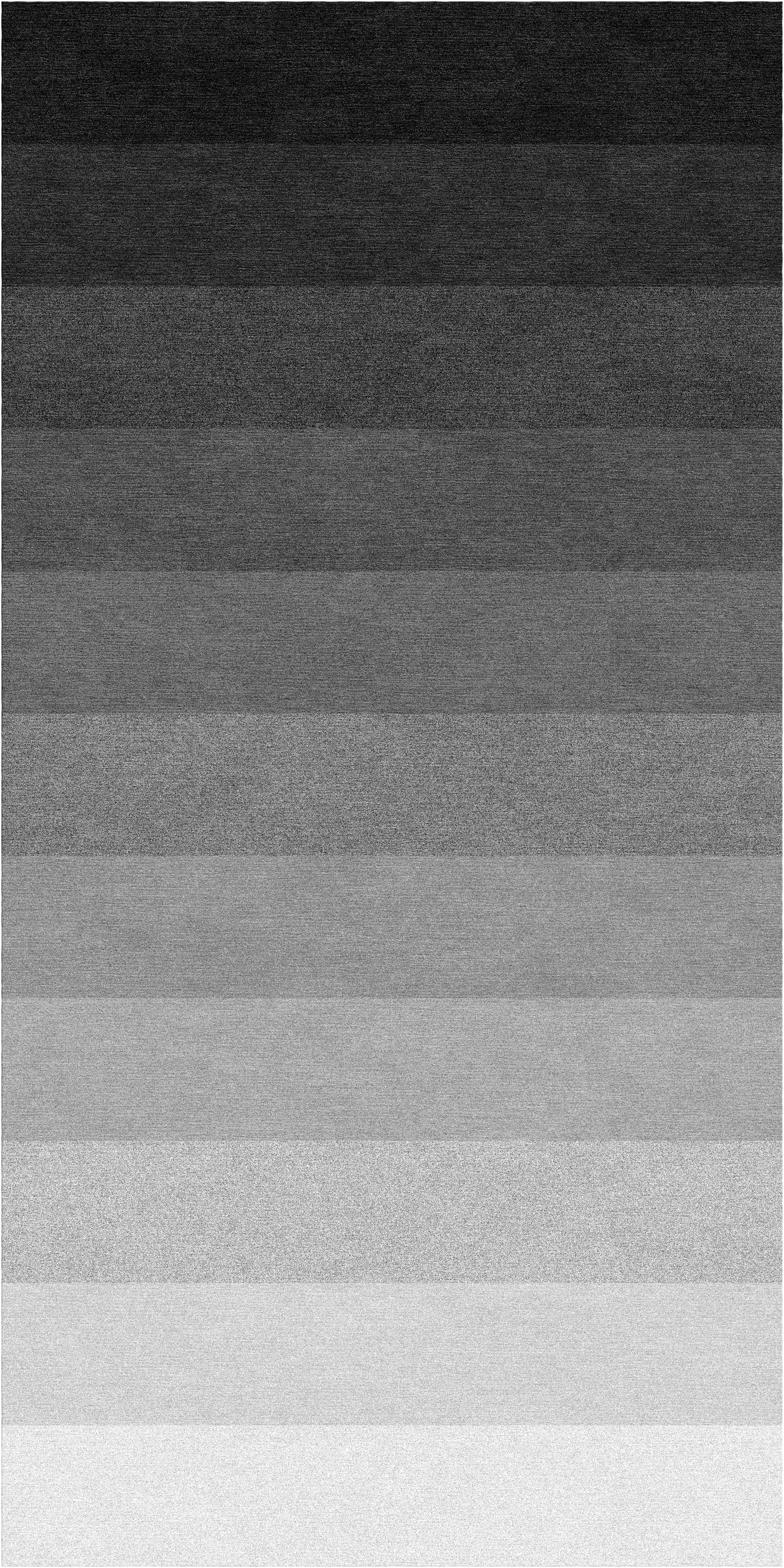
Here’s the difference between using 5 colors and 12 colors:

- Selection of the colors as primary and secondary colors for creating gradients.
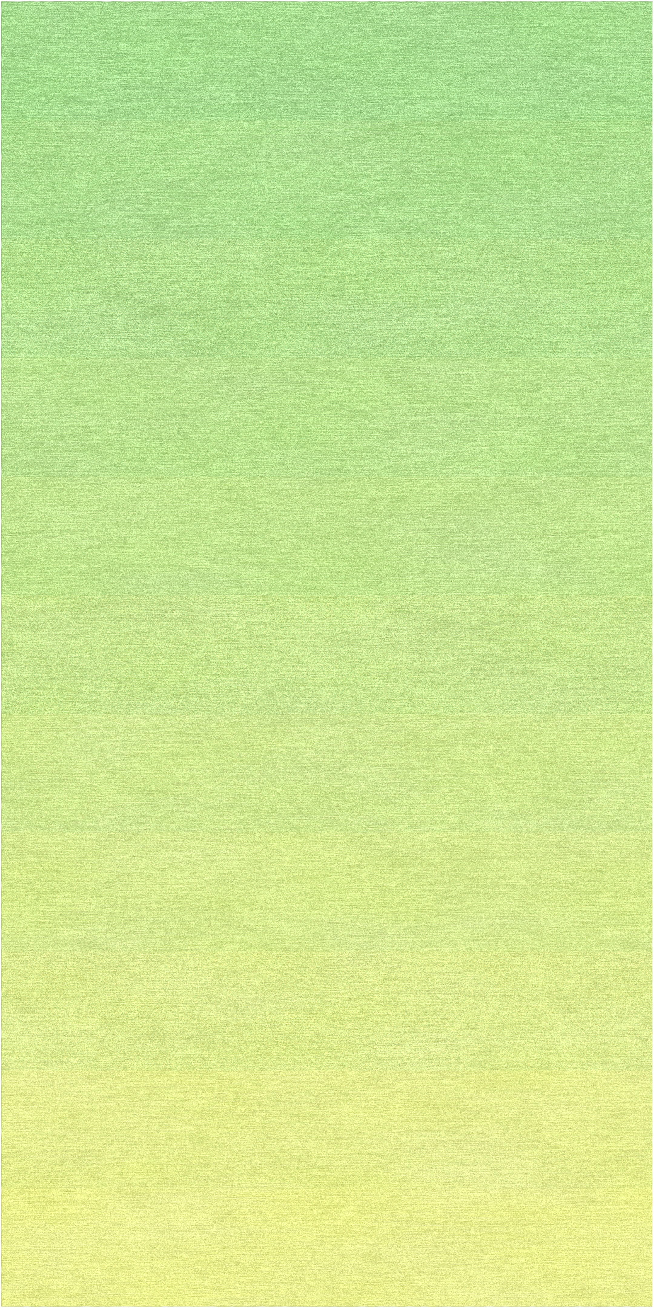
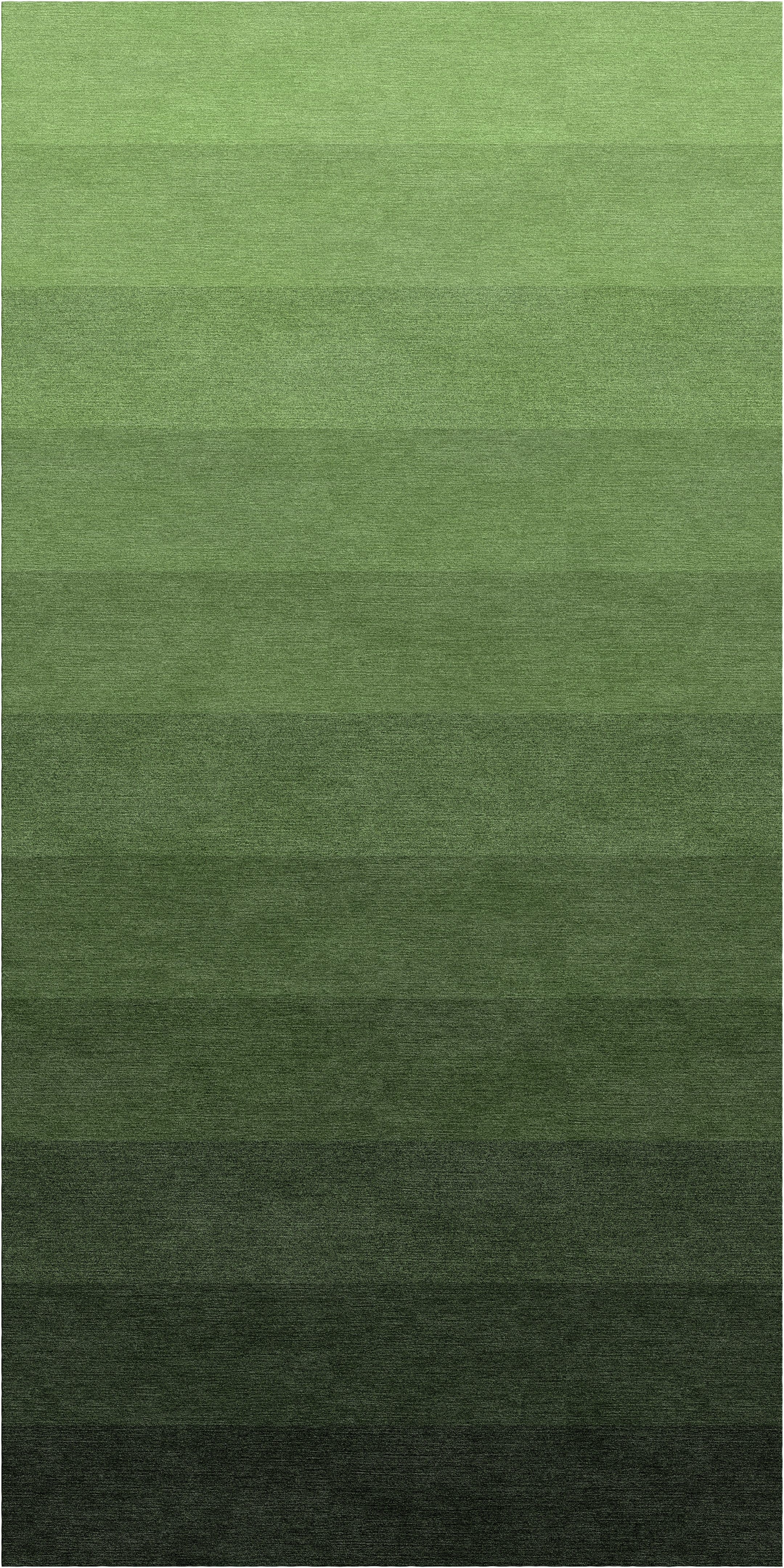
Below visualization shows the difference between using contrasting colors and similar colors:
- Tone difference between the two colors.
Using two warm tone colors gives a smooth gradient than two contrasting tones.
Hence, It is suggested to use more colors for visualization, otherwise, using slightly less contrasting tones of the colors can be selected for a smoother gradient.
Comments
0 comments
Please sign in to leave a comment.